
Developer guide#
Note
Note that this guide will only the implementation at a high-level. For more details,
see the AbstractPlot (abstract class), and
MyBar (example class) implementations,
which contain more information.
This guide will show you how to add new plots to sklearn-evaluation.
Object-oriented API#
All plots are implemented using an object-oriented API, this implies that each plot is a class.
Users interact with the plots via a from_raw_data method, that takes raw, unaggregated data as input, optional arguments to customize the plot, and an optional name argument to idenfity the plot.
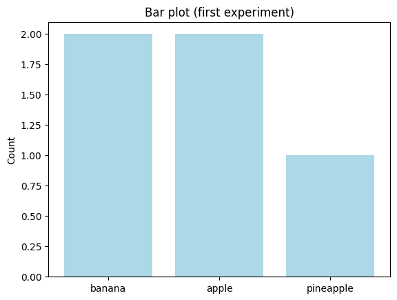
Let’s see an example. Our example plot takes a list of elements and it produces a bar plot with the count for each different value:
from sklearn_evaluation.plot._example import MyBar

bar = MyBar.from_raw_data(
    ["banana", "banana", "apple", "pineapple", "apple"],
    color="lightblue",
    name="first experiment",
)
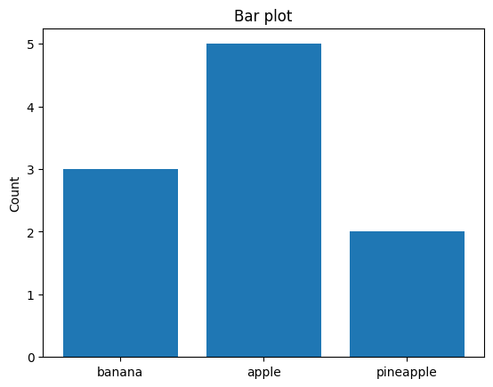
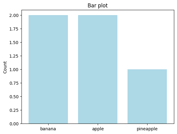
The constructor must take aggregated data. End-users do not typically call the constructor directly; however, it’s still part of the public API. Unlike our from_raw_data, the constructor takes aggregated data (the counts):
bar_second = MyBar({"banana": 3, "apple": 5, "pineapple": 2})
Plots implement a .plot() method where all the plotting logic happens:
bar_second.plot()
<sklearn_evaluation.plot._example.MyBar at 0x7fb56bb3ac20>
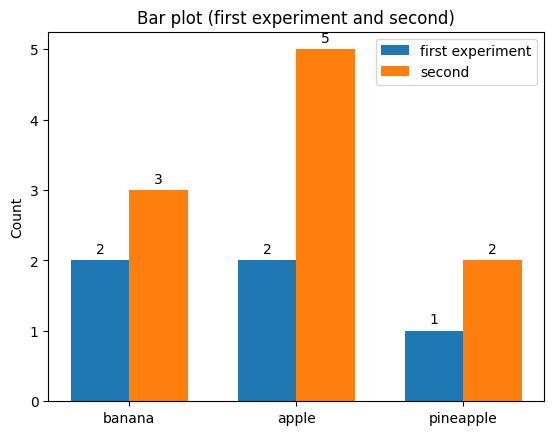
Addition#
The plot might support the + operator, which should produce a combined plot to compare both plots (order might matter in some cases, but not always):
bar + bar_second
<sklearn_evaluation.plot._example.MyBarAdd at 0x7fb56ad4ad70>
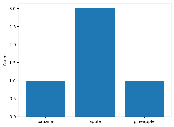
Substraction#
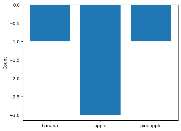
If it makes sense for your plot, you might add support for the - operator, which should create a combined plot to summarize results from two in individual plots:
bar_second - bar
<sklearn_evaluation.plot._example.MyBarSub at 0x7fb56ad9f940>
Note that order is important:
bar - bar_second
<sklearn_evaluation.plot._example.MyBarSub at 0x7fb56a946a10>
Serialization#
Plots should implement a private _get_data() method to return all necessary data required to re-create the plot:
bar._get_data()
{'class': 'sklearn_evaluation.plot._example.MyBarPlot',
 'count': {'banana': 2, 'apple': 2, 'pineapple': 1},
 'color': 'lightblue',
 'name': 'first experiment',
 'version': '0.12.1dev'}
A .dump() method to dump this data into a JSON file:
bar.dump("bar.json")
And a from_dump() class method to load a plot from a JSON file:
MyBar.from_dump("bar.json")
<sklearn_evaluation.plot._example.MyBar at 0x7fb56bb3bc10>
Functional API#
from sklearn_evaluation.plot._example import my_bar

result = my_bar(["banana", "banana", "apple", "pineapple", "apple"], color="lightblue")
type(result)
matplotlib.axes._axes.Axes
Guidelines#
Tip
For general guidelines, see Ploombers’ documentation framework.
To provide a consistent user experience, all the functions that produce plots follow a few conventions.
Classes and functions must be importable from sklearn_evaluation.plot#
Add them to src/sklearn_evaluation/plot/__init__.py
Do not set figure/text sizes#
We should not hardcode figure or font sizes inside the plots; we should allow the user to decide on this.
Classes/Functions should not contain plot in its name#
Example:
# not confusion_matrix plot!
def confusion_matrix(y_true, y_pred):
    pass

class ConfusionMatrix:
    pass
Every argument except the input data should have default values#
Example:
class ConfusionMatrix:
    def __init__(self, cm, target_names=None):
        pass

    def from_raw_data(cls, y_true, y_pred, target_names=None):
        pass

def confusion_matrix(y_true, y_pred, target_names=None, ax=None):
    pass
Follow the argument naming convention#
Many of the functions take a vector of real values (first argument) and a vector of predicted values (second argument), they should be named y_true and y_pred respectively.
def some_algorithm(y_true, y_pred, ..., ax=None):
    pass
See the confusion_matrix function for an example.
If the plotting function applies to classifiers (e.g., confusion matrix), and the raw scores from the models are the input (instead of the predicted class), the second argument should be named y_score:
def some_algorithm(y_true, y_score, ..., ax=None):
    pass
See the precision_at_proportion function for an example.
In cases where the function doesn’t take a true and predicted vector, the names should be descriptive enough:
def some_algorithm(some_meaningful_name, ..., ax=None):
    pass
See the learning_curve function for an example.
Testing#
Each function must have a corresponding test. If the function has parameters that alter the plot, they should be included as well as separate tests. See the plot tests here.
The first time you run the tests, it’ll fail since there won’t be baseline images to compare to. Example:
OSError: Baseline image ‘/Users/eduardo/dev/sklearn-evaluation/result_images/test_bar/mybar-expected.png’ does not exist.
Go to result_images/{test_file_name}/{baseline_image_name}.png and check if the plot is what you’re expecting. If so, copy the image into: tests/baseline_images/{test_file_name}/{baseline_image_name}.png, then run the tests again, they should pass now.
For example tests, see tests/test_bar.py
Documentation#
The function must contain a docstring explaining what the function does and a description of each argument. See this example.
Furthermore, a full example (under the docstring’s Examples section)must be included in the examples section of the docstring. Such an example must be standalone so that copy-paste should work. See this example. Note that these examples are automatically tested by the CI.
Each function’s docstring should also have a Notes section with a .. versionadded:: to specify from which version this plot is available.
The current dev version of sklearn-evaluation can be found in here. So, if current dev version is 0.0.1dev, the version of the next release will be 0.0.1.
Here’s a docstring template you can use:
def my_plotting_function(y_true, y_pred, ax=None):
    """Plot {plot name}

    Parameters
    ----------
    y_true : array-like, shape = [n_samples]
        Correct target values (ground truth).

    y_pred : array-like, shape = [n_samples]
        Target predicted classes (estimator predictions).

    ax: matplotlib Axes
        Axes object to draw the plot onto, otherwise uses current Axes

    Returns
    -------
    ax: matplotlib Axes
        Axes containing the plot

    Examples
    --------
    .. plot:: ../examples/{example-name}.py

    Notes
    -----
    .. versionadded:: 0.0.1
    """
    pass
Styling plots#
Using our context style feature we can change matplotlib rcParams and easily manipulate the overall visual style of our plots. The default style features a frame with borders only on the left and bottom of the plot, and a monochromatic color scheme of one color from the material UI color palette. However, we have the ability to adjust both the cmap and the style of the chart itself using the parameters ‘cmap_style’ and ‘ax_style’.
We support 2 variants of ax styles:
ax_style : ["no_frame", "frame"]
And 2 styles of cmap:
cmap_style : ["monochromatic", "gradient"]
Examples#
import numpy as np
import matplotlib as mpl
import matplotlib.pyplot as plt
from sklearn_evaluation.plot.style import apply_theme
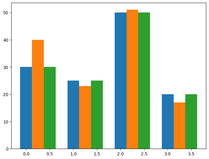
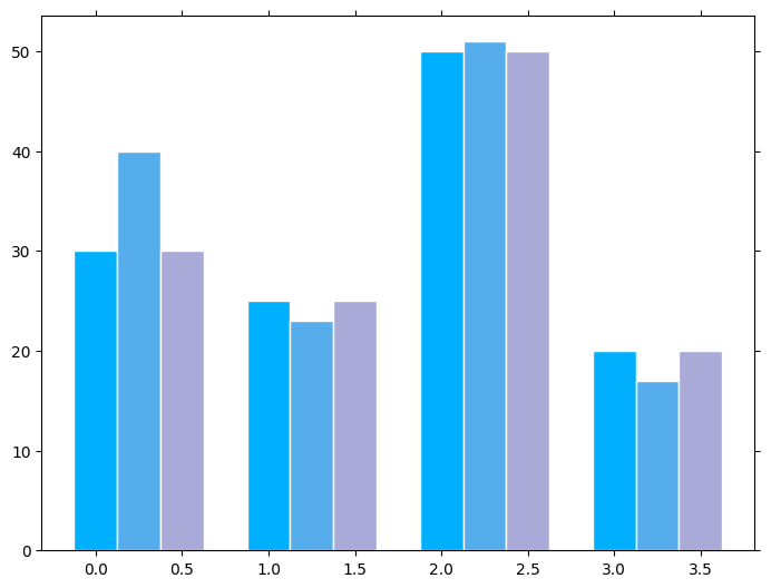
We will create a function called “plot_bar” that will generate a basic bar chart.
def plot_bar():
    data = [[30, 25, 50, 20], [40, 23, 51, 17], [30, 25, 50, 20]]
    X = np.arange(4)
    fig = plt.figure()
    ax = fig.add_axes([0, 0, 1, 1])

    offset = 0
    for i in range(len(data)):
        ax.bar(X + offset, data[i], width=0.25)
        offset += 0.25


plot_bar()
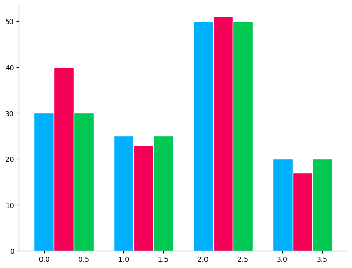
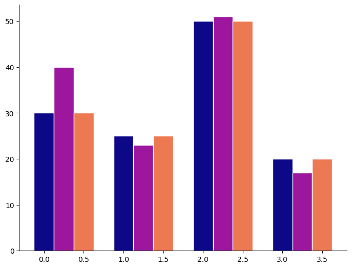
Now, add the apply_theme decorator to apply a style where each bar is colored with a different color from the palette.
This is the default style of our plots.
@apply_theme()
def plot_bar_with_default_style():
    plot_bar()


plot_bar_with_default_style()
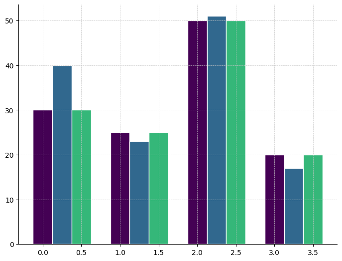
We can also use cmap to color our plots.
def plot_bar_with_cmap(cmap=None):
    data = [[30, 25, 50, 20], [40, 23, 51, 17], [30, 25, 50, 20]]

    X = np.arange(4)
    fig = plt.figure()
    ax = fig.add_axes([0, 0, 1, 1])

    offset = 0
    for i in range(len(data)):
        color = mpl.colormaps.get_cmap(cmap)(float(i) / len(data))
        ax.bar(X + offset, data[i], width=0.25, color=color)
        offset += 0.25


plot_bar_with_cmap(cmap="plasma")
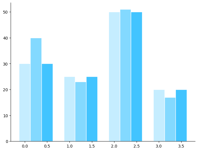
The default style will be a monochromatic coloring which is a palette in which a single color tint is used.
@apply_theme()
def plot_bar_with_cmap_default_style():
    plot_bar_with_cmap()


plot_bar_with_cmap_default_style()
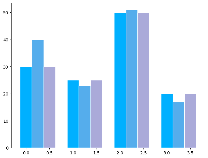
Use cmap to color each bar with the gradient style, which is a palette of two colors gradually shift from one to another.
@apply_theme(cmap_style="gradient")
def plot_bar_with_gradient():
    plot_bar_with_cmap()


plot_bar_with_gradient()
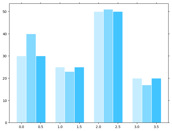
Modify ax_style to display a framed plot
@apply_theme(ax_style="frame")
def plot_bar_with_frame():
    plot_bar_with_cmap()


plot_bar_with_frame()
Modify ax_style and cmap
@apply_theme(ax_style="frame", cmap_style="gradient")
def plot_bar_with_frame_and_cmap():
    plot_bar_with_cmap()


plot_bar_with_frame_and_cmap()
We can even add a custom style on top of our style:
@apply_theme()
def plot_bar_with_cmap(cmap=None):
    data = [[30, 25, 50, 20], [40, 23, 51, 17], [30, 25, 50, 20]]

    X = np.arange(4)
    fig = plt.figure()
    ax = fig.add_axes([0, 0, 1, 1])

    offset = 0
    for i in range(len(data)):
        color = mpl.colormaps.get_cmap(cmap)(float(i) / len(data))
        ax.bar(X + offset, data[i], width=0.25, color=color)
        offset += 0.25

    ax.grid(color="#c6c6c6", linestyle="--", linewidth=0.5)


plot_bar_with_cmap(cmap="viridis")
Guidelines (functional API)#
The last argument in the function must be ax=None#
The last argument should be ax=None. If the user passes a value (a matplotlib.axes.Axes object), the plot must be created there. If not, we should use the default axes with ax = plt.gca().
def some_algorithm(a, b, ..., ax=None):
    pass
See the roc function for an example.
Telemetry#
Monitoring the state of sklearn-evaluation
Use SKLearnEvaluationLogger decorator to generate logs
Example:
@SKLearnEvaluationLogger.log(feature='plot')
def confusion_matrix(
        y_true,
        y_pred,
        target_names=None,
        normalize=False,
        cmap=None,
        ax=None,
        **kwargs):
pass
this will generate the following log:
        {
          "metadata": {
          "action": "confusion_matrix"
          "feature": "plot",
          "args": {
                        "target_names": "None",
                        "normalize": "False",
                        "cmap": "None",
                        "ax": "None"
                    }
          }
        }
** since y_true and y_pred are positional arguments without default values it won’t log them
Queries#
Run queries and filter out
sklearn-evaluationevents by the event name:sklearn-evaluationBreak these events by feature (‘plot’, ‘report’, ‘SQLiteTracker’, ‘NotebookCollection’)
Break events by actions/func name (i.e: ‘confusion_matrix’, ‘roc’, etc…)
Errors#
Failing runnings will be named: sklearn-evaluation-error